top of page


KUM & GO
Brand Refresh
Kum & Go is both a name and an idea. The convenience store is about exactly that: convenience. bold colors and shapes combine with a simple form to reflect the efficiency and simplicity that one should expect from a one-stop shop.


Creation
Kum & Go is a brand that stands for convenience. It was critical to ensure that the logo captured that. Simplified bold letterforms combined with dynamic and unique shapes create the perfect visual for recognition at a glance. This is ideal for capturing the eye in a fast-paced setting, such as driving in a car.
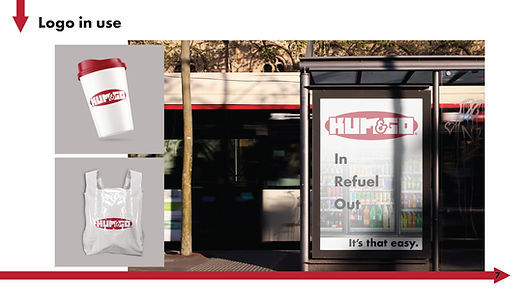
The icon idea stemmed from the contemporary setting. A media presence is one of the most important pieces to a brand today. The icon was a small detail but a necessary one. This gives the opportunity not only to create a clean and identifiable media presence but also to produce unobtrusive branded media such as posters, billboards, and other advertising.
bottom of page